BACKGROUND INFOrmation
Yang Chen is a Tkaronto-based experimental classical musician and percussionist. They were seeking a brand identity that communicated their Chinese-Canadian heritage, search for collaborators, and love of play in their work.
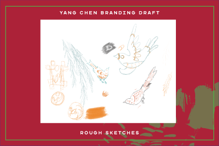
The Process
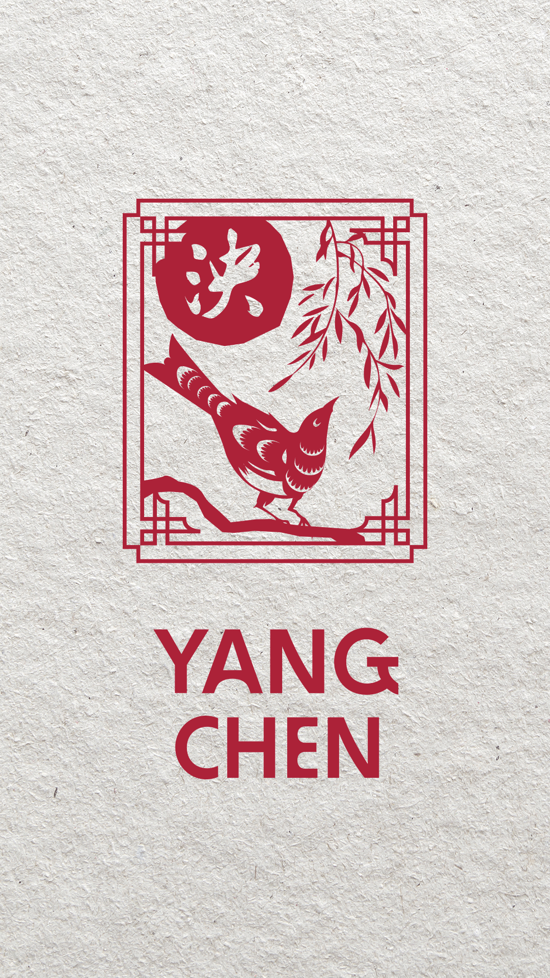
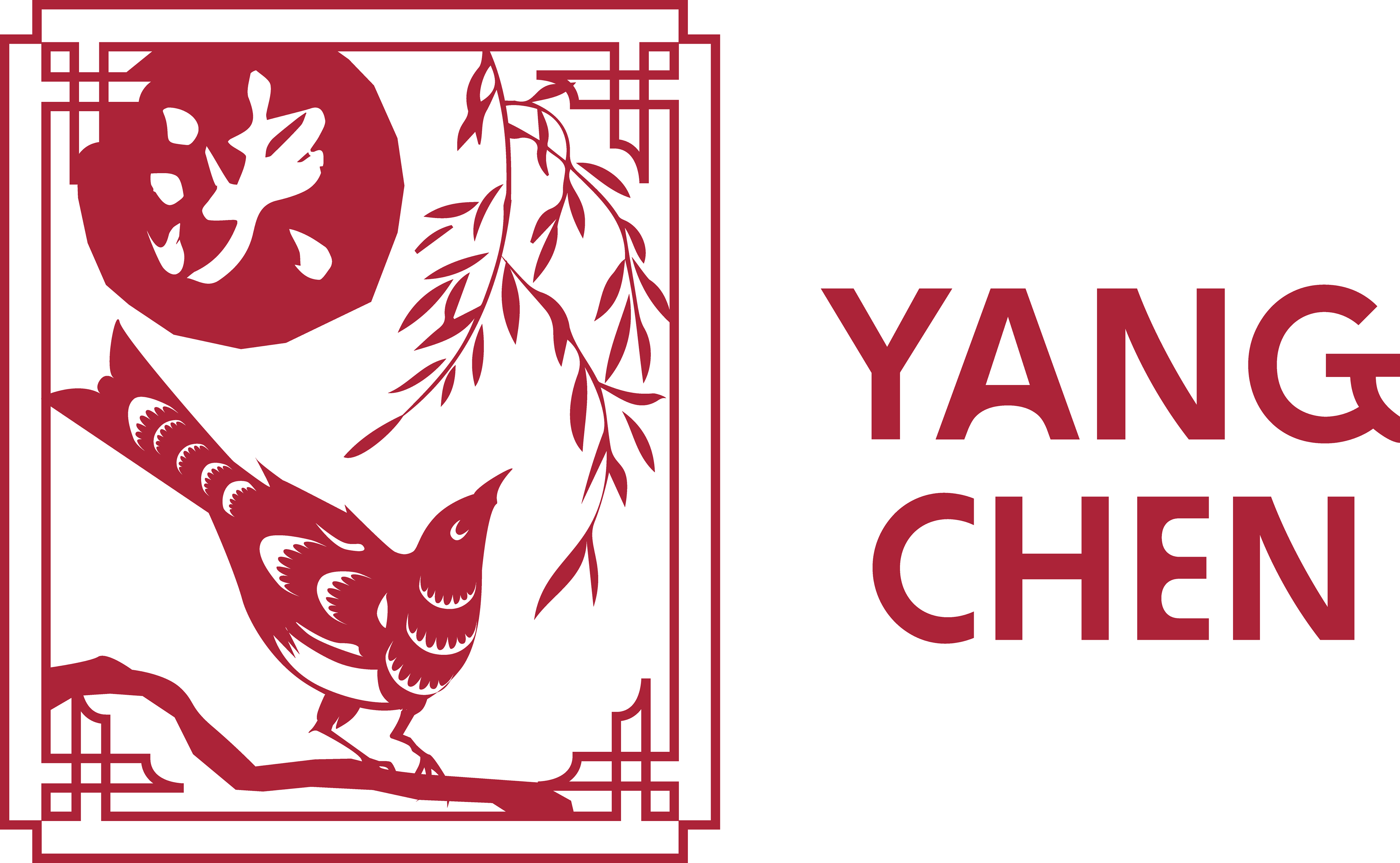
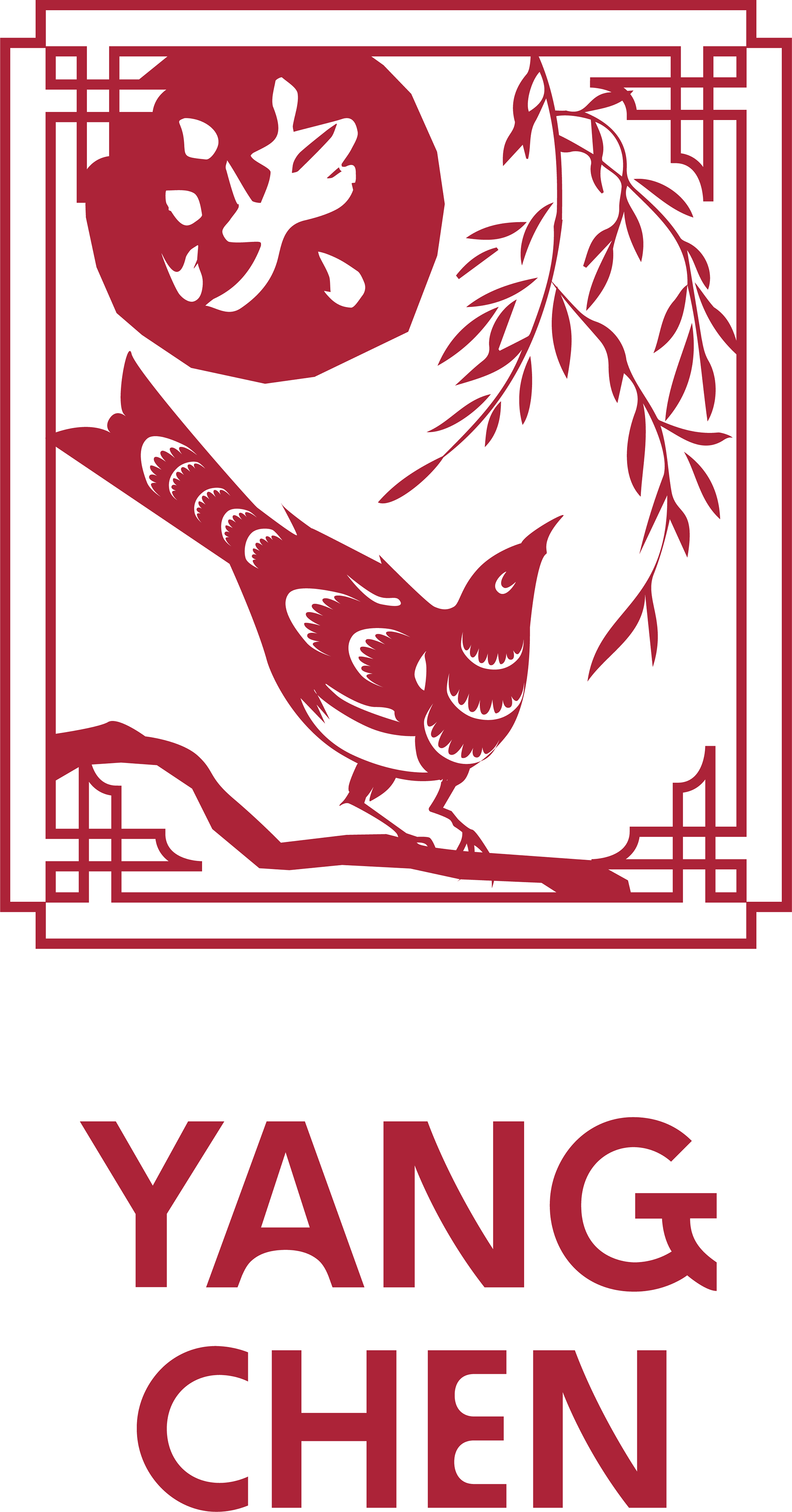
Yang hoped to create a warm, approachable and friendly image that would also establish a solid, no-nonsense business presence. They also hoped to have a logo incorporating their Chinese name, 泱, meaning a body of water so great that its bounds are imperceptible. They are also a pisces, which means that water is very important in representing who they are. In consultation with their mother, a calligraphy student, the lettering in their logo refers to calligraphy from a famous calligrapher in the Ming dynasty. Held inside a Chinese-style frame are a magpie, a willow branch, and the moon. Magpies in Chinese symbology are often portrayed in pairs, representing harmony, joy, and union. This magpie is alone, seeking collaborators. There is also a willow as a strong but gentle protective symbol of safety and belonging, as well as its associations with water, and the moon for its ties to yin energy, and its effects on the tides. Inside the moon is the calligraphy of their name. The moon with their name is also used as the website favicon. The font used for their name, below the frame, is BD Supper, and comes across as warm and playful, with round bouncy shapes. I also created an animated logo, with water spilling into the ink, bleeding out into the paper, becoming boundless, harmonizing with the paper.
The Project